How to make tabs in React (The practical way) 💻🚀


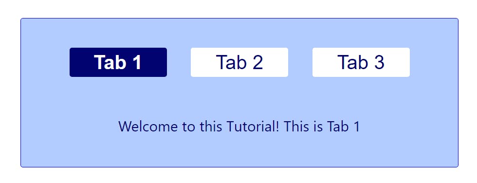
Hi there! I'm Darshit, a frontend software developer. I love everything React and Javascript. Here, I'm gonna teach you how to make tabs with content in React. When you're done building, it'll probably look something like this:
I'm assuming you're already in a react project. Therefore, I'm just going to focus on the component.
My main focus for this tutorial is going to be the logic of the tabs. I'll paste the CSS styles below, feel free to use them in your component. I'm not gonna spoon feed you the solution. The purpose of this tutorial is to take you through my thought process and help you understand how to tackle problems when you build stuff on your own.
Let's begin ...
On seeing the picture above something of this sort must've come to your mind :
import React from 'react';
import './Tabs.css';

const Tabs = () => {
    return (
        <div className='outerContainer'>
            <div className='tabContainer'>
                <div className='tab active'>Tab 1</div>
                <div className='tab'>Tab 2</div>
                <div className='tab'>Tab 3</div>
            </div>
            <p>Welcome to this Tutorial! This is Tab 1</p>
        </div>
    )
}

export default Tabs
But there's two things wrong with this code.
- We're repeating ourselves by creating multiple tab divs.
- Tabs and paragraphs are static
But don't worry, software engineering is all about solving problems. And we shall take on these two challenges.
Problem #1. Repeating yourself:
In the real world you'll probably receive data in props which will have both, the tab headings and the paragraph which you will show when a certain tab is clicked. So this is the content that you would receive from the backend:
let content = [
        {
            tabTitle: 'Tab 1',
            description: 'Welcome to this Tutorial! This is Tab 1',
        },
        {
            tabTitle: 'Tab 2',
            description: 'This is Tab 2'
        },
        {
            tabTitle: 'Tab 3',
            description: 'You have made it to the end! This is Tab 3'
        }
    ]
Since you have your data in an array, you can use the map method and create multiple divs like so:
let tabs = content.map((item, index) => {
        return <div key={index} className='tab'>{item.tabTitle}</div>
    })
and the tab container gets modified to:
<div className='tabContainer'>{tabs}</div>
Problem #2. Making it interactive:
So to change the paragraphs below on tab click and track which tab is currently active we will use:
/*initial state is set to the first paragraph*/
let [paragraph, setParagraph] = useState(content[0].description)
/*initial active tab will be set to the first index i.e. 0*/
let [activeTab, setActiveTab] = useState(0)
and we use the paragraph(state) instead of the static paragraph:
<p>{paragraph}</p>
Okay, so now we have to set the state to the paragraph whose tabTitle was clicked.
We will do so by creating a function handleActiveTab with index as a parameter. Why index ? If I know the index of object which contains the clicked tabTitle, I can access the same object's description as well.
The function :
const handleActiveTab = (index) => {
        /*set the paragraph according the title which was clicked*/
        setParagraph(content[index].description);
        /*set which tab is active (current index)*/
        setActiveTab(index)
    }
Now all I have to do is call this function whenever a tab is clicked. To do that, the map part of the code changes to:
let tabs = content.map((item, index) => {
        return <div
            key={index}
            className='tab'
            onClick={() => handleActiveTab(index)}
        >
            {item.tabTitle}
        </div>
    })
The last thing that we need to do is show which tab is active. We do that by adding the class active in the above code. We need to add the active class only if index is equal to the activeTab(state). A simple ternary statement for className and it looks like this:
let tabs = content.map((item, index) => {
        return <div
            key={index}
            className={activeTab === index ? 'tab active' : 'tab'}
            onClick={() => handleActiveTab(index)}
        >
            {item.tabTitle}
        </div>
    })
Congratulations! You've learned how to build tabs in react.
I also hope that this tutorial helped you understand how to approach a problem and break it down into simple manageable parts.
Thanks for reading.
Resources:
Component Code
import React from 'react';
import './Tabs.css';
import { useState } from 'react';

const Tabs = () => {
    let content = [
        {
            tabTitle: 'Tab 1',
            description: 'Welcome to this Tutorial! This is Tab 1',
        },
        {
            tabTitle: 'Tab 2',
            description: 'This is Tab 2'
        },
        {
            tabTitle: 'Tab 3',
            description: 'You have made it to the end! This is Tab 3'
        }
    ]
    /*state*/
    let [paragraph, setParagraph] = useState(content[0].description)
    let [activeTab, setActiveTab] = useState(0)
    const handleActiveTab = (index) => {
        /*set the paragraph according the title which was clicked*/
        setParagraph(content[index].description);
        /*set which tab is active (current index)*/
        setActiveTab(index)
    }
    let tabs = content.map((item, index) => {
        return <div
            key={index}
            className={activeTab === index ? 'tab active' : 'tab'}
            onClick={() => handleActiveTab(index)}
        >
            {item.tabTitle}
        </div>
    })
    return (
        <div className='outerContainer'>
            <div className='tabContainer'>{tabs}</div>
            <p>{paragraph}</p>
        </div>
    )
}

export default Tabs
Styles
/* container styling */
.outerContainer{
    width: 900px;
    padding: 40px 30px 40px 30px;
    border: 1px solid blue;
    border-radius: 5px;
    background-color: rgba(102, 153, 255, .5);
}

/* text styling */
.outerContainer p {
    color: #000370;
    margin: 60px 0px 25px 0px;
    font-size: 30px;
    text-align: center;
}

/* tab container styling */
.tabContainer {
    display: flex;
    align-items: center;
    justify-content: space-evenly;
    padding: 20px;
}
/* individual tabs styling */
.tabContainer .tab {
    cursor: pointer;
    color: rgba(0, 3, 112, 1);
    font-size: 40px;
    background-color: #fff;
    width: 200px;
    height: 60px;
    text-align: center;
    border-radius: 5px;
    border: none;
}

/* active class which shows what tab is currently active */
.tabContainer .active {
    background-color: rgba(0, 3, 112, 1);
    color: #fff;
    font-weight: 600;
}